ldcss
A custom css framework with css and js. techy style but with escape hatches for more fluid styles
About
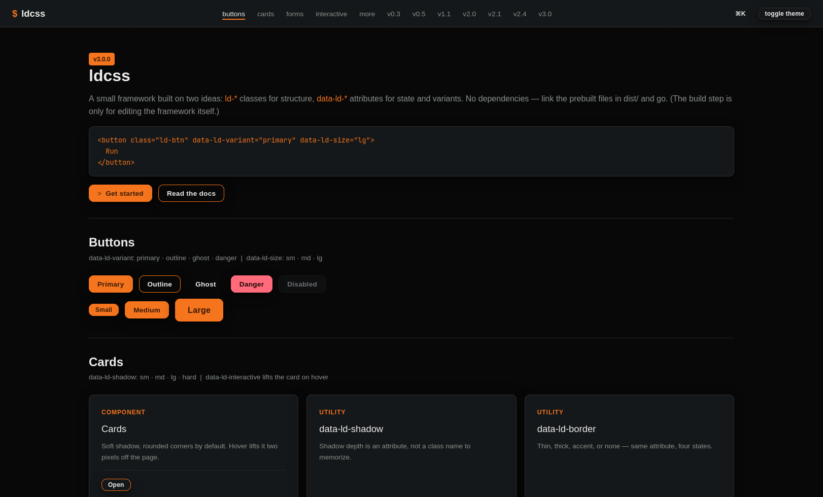
LDCSS is a CSS framework with built-in JavaScript designed to provide a consistent, feature-rich foundation for building modern websites and web applications. It combines a large library of reusable components, utility classes, and custom HTML attributes to reduce boilerplate code while keeping projects organized and easy to maintain — all shipped as a single CSS file and a single JS file, with no build step required.
The framework extends standard HTML with its own naming conventions, using ld- classes for styling and data-ld- attributes for JavaScript-powered functionality. This split keeps a component's markup readable at a glance — structure and appearance live in classes, interactive state lives in attributes — so features like modals, tabs, comboboxes, or a command palette can be wired up directly in markup with minimal configuration, without hand-rolling the JavaScript behind them.
Out of the box, LDCSS now favors a clean, modern default: rounded corners, soft layered shadows, restrained borders, and a system sans-serif typeface, with a light/dark theme built in from the start. Every one of those defaults is just a CSS custom property, so the look is fully customizable — right down to a data-ld-shadow="hard" escape hatch for teams who want the framework's earlier sharp-cornered, monospaced, terminal-inspired aesthetic back. Nothing about the visual language is hardcoded against being overridden.
The component library covers most of what a real interface needs: navigation (navbar collapse, breadcrumbs, scrollspy), overlays (modals, offcanvas panels, dropdowns, popovers, a command palette with ⌘K), forms (floating labels, validation states, comboboxes, tag inputs, dropzones, rating inputs, range sliders), data display (sortable and sticky-header tables, pagination, timelines, steppers, carousels), and feedback (toasts, skeletons, progress bars). Layout is handled by both an even-split grid and a full 12-column responsive grid, backed by a wide utility-class system — spacing, typography, flexbox, and breakpoint-aware variants down to order, display, and text alignment. Accessibility isn't an afterthought either: focus trapping and return, ARIA wiring, roving tabindex, reduced-motion and forced-colors support, and RTL-aware logical properties are built into the components themselves.
The project is under active, versioned development — currently at v2.3.0 — with a public changelog tracking every addition, fix, and (rare, clearly-flagged) breaking change. New releases keep the same priorities: reducing repetitive code, tightening consistency across projects, and making it possible to build a polished, accessible interface without reaching for several external libraries at once.
Built with
CSS, JS